Article
8 min read
Labo(u)r market roundup: September 2026

Author
Lauren Thomas
Published
September 18, 2026


The labour market picture in the US is pretty steady this month
Job openings, unemployment, quits and hires all hold steady
The BLS JOLTS and the Employment Situation, released earlier this month, once again showed little change from the previous month.
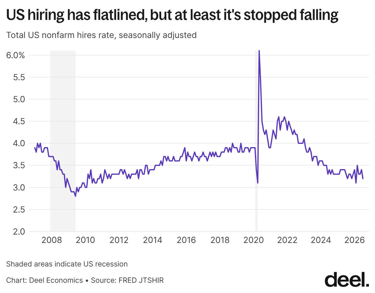
Job openings in July, at 7.3 million, were little changed from June. Hiring and quits rates were similarly stable, at 4.4% and 3.2% respectively. That's both good and bad news: the hires rate is as weak as it was during the immediate post-financial-crisis recovery in 2012, but at least it's stopped falling.
In fact, the hires rate has barely moved since late 2024, averaging 3.3% over the past two years with a standard deviation of just 0.08%. That stability looks stark next to what came before it: between August 2022 and July 2024, the hires rate's standard deviation was 0.24% — three times as high. Similarly, unemployment was unchanged at 4.1%.
Payrolled employment rebounded - but don’t read too much into one month
By contrast, payrolled employment had a bumper month in August – rising by 162,000, much higher than the average gain of 31,000 over the prior 12 months as well as economists’ expectations of 56,000. And it came off a below-expectations July, which added only 21,000 jobs (revised upwards from a fall of 23,000).
The report generated plenty of press attention, but it's worth resisting the urge to read too much into any single month's print. While we’ve talked before about the negative impact of covid on the reliability of labor market statistics in the UK, some of the same pressures have also been present in the US market.
Revisions are a routine feature of this data, not the exception: July's figure alone was revised upwards by 44,000 between reports, while June's was revised downwards by 21,000 from its original figure. Taken together, these swings are a reminder that the "first read" on payrolls is always provisional.
The employment picture looks very different by industry
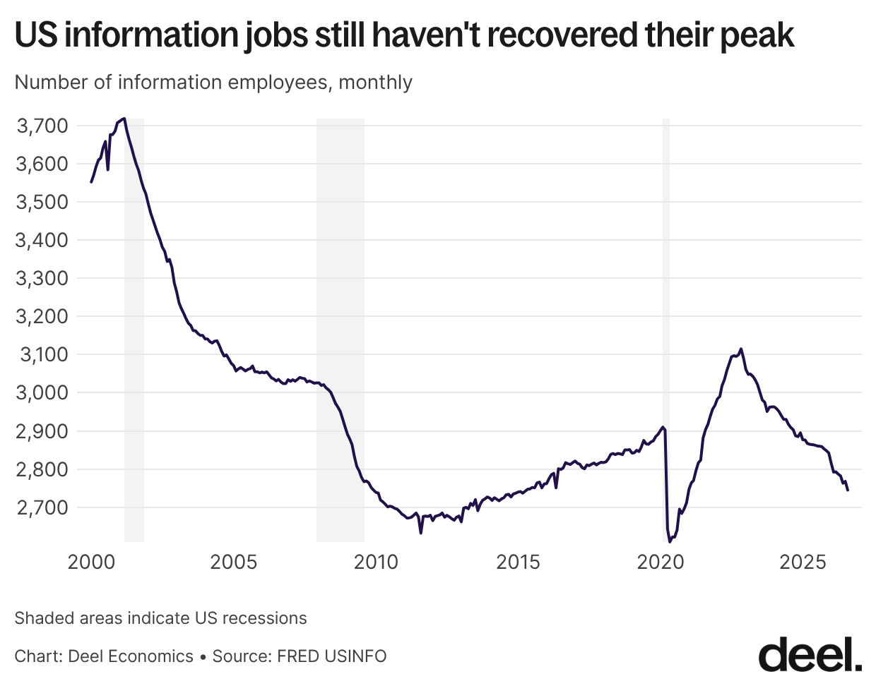
What’s most interesting to me is the difference between industries. The BLS flagged the fall of 23,000 jobs in information in August. Information employment has repeatedly been dropping, averaging monthly losses of 8000 jobs over the past year and falling 11.8% since its last peak in 2022.
The easy explanation is AI. But the pressures on this industry go back further than the current AI wave: higher interest rates, the temporary expiry of a key R&D tax incentive from the 2017 Tax Cuts and Jobs Act, and the post-pandemic shift from online back to offline worlds all pushed the industry into shedding jobs starting in 2022, before generative AI tools saw meaningful workplace adoption.
Even so, as bad as an 11.9% fall might feel, it's modest next to the ten-year decline in information employment between 2001 and 2011, when the sector shed jobs almost continuously for a full decade. Information employment still hasn't recovered to its dot-com-era peak.
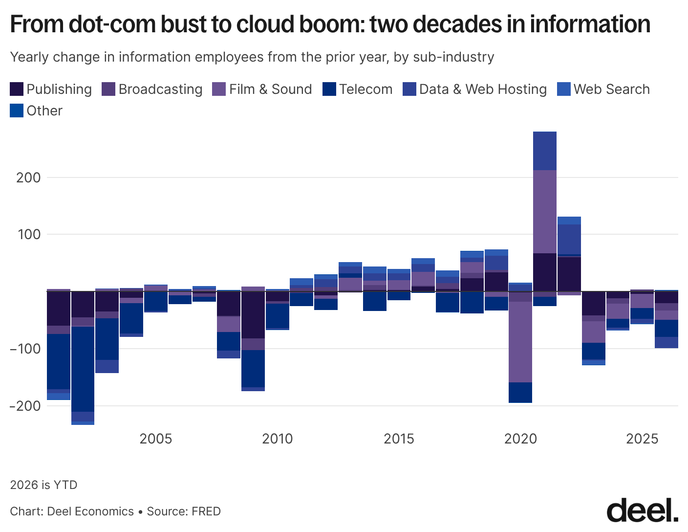
Of course, information includes media and newspapers, which have been declining for years, as well as film, which had its own boom-bust cycle around the pandemic. The chart below shows just how differently each sub-industry has moved since 2000 and the dot-com bust. Unlike the 2000s (telecom and publishing collapsing) or the 2010s (a genuine cloud-driven recovery), this decade's weakness is concentrated in the very same data-and-web-hosting jobs that boomed in 2021–22.
Could some of this decline in tech be from a rise in self-employment? Our friends over at Stripe Economics have documented a strong case for a rise in the number of self-employed individuals in the US. I’d say it’s very likely a share of those new self-employed individuals are former tech workers. Still, given the scale of the numbers here, self-employment is unlikely to explain more than a modest slice of the decline.
What should we expect in the coming months? My guess is a continued, modest decline in information employment. Rate cuts look unlikely any time soon; if anything, the Fed just moved in the opposite direction, raising its benchmark rate by 25 basis points to a range of 3.75%–4% on September 16, its first hike since 2023. That leaves borrowing costs elevated for the kind of capital-intensive investment (data centers, infrastructure buildout) that had been propping up hiring in this sector (and of course, the jury is still out on how AI will impact jobs in the industry).
On the other side of the ledger, healthcare employment has kept trending up, albeit at a slower pace than in recent years. Healthcare will need to keep carrying overall job growth, but I wouldn't read too much into the slowdown. The sector's underlying secular pressures – an aging population, heavy regulation, and comparatively low exposure to AI – continue to support hiring, even if the pace has cooled.
Broad cooling in the UK
Payrolled employment fell again – what’s driving it?
The UK ONS released its monthly labour market overview on Tuesday. The first thing that stood out to me: payrolled employees have dropped by 100,000 (0.3%) in the last year. There are basically four main things that will feed into changes in payrolled employment: unemployment, economic inactivity, self-employment, and a change in the labour supply population. What’s happening in each of these corners of the labour market?
Unemployment has modulated, but is increasingly long-term
Economic inactivity has barely moved - it’s at 20.9%, up just 12,000 people over the year. So the drop in payrolled employment can’t be from people leaving the workforce altogether.
What about the unemployed? Unemployment is 4.9%, up by 0.2 pp from last year, but largely unchanged from last quarter. Higher unemployment will of course feed into lower payrolled employment, so it’s likely that is playing a role.
Interestingly, much of the recent rise in unemployment has come specifically from long-term unemployment. Since mid-2025, short-term unemployment as a share of the total active workforce has plateaued, but long-term unemployment has risen. Over the last year, the percentage of all the economically active who are unemployed for more than 6 and less than 12 months has doubled (from 0.48% to 0.94%).
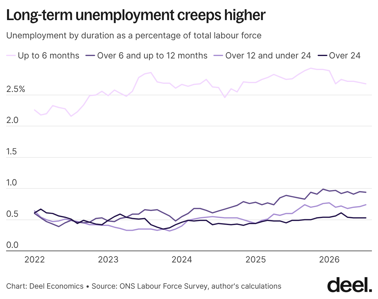
That’s a meaningful addition to the unemployment story - a rise in long-term unemployment is particularly concerning as households will naturally have a harder time making ends meet as they spend longer without work. Still, the overall fraction of long-term unemployed is tiny, and the share over 24 months doesn’t appear to have grown much in 2024.
A historic migration reversal could be reshaping labour supply
Birth and death rates in the UK are roughly balanced, so most of the recent swings in the size of the labour force have come from migration rather than natural population change. Much of the surge in the working-age population between 2021 and 2023 was down to a historic spike in net migration — and that spike has now gone sharply into reverse.
Net migration fell from a record 745,000 in 2022 to just 171,000 in 2025. It's a reasonable bet that this has played a role in the payrolled employment numbers, though it's hard to say exactly how much: we won't know the 2026 net migration figure until next May, and not everyone who arrives feeds into the workforce in the same way — someone on a work visa is far more likely to start working immediately than someone arriving on a student or spouse visa.
One way to get a clearer read on the "new worker" side of that equation specifically is to look at work-visa and graduate-route entrants directly, rather than net migration as a whole. The chart below shows exactly that: new work visas issued to people arriving from abroad, plus in-country graduate-route entrants, by half-year since 2022. The picture is stark: entrants peaked at 177,600 in the second half of 2023, then fell by more than half to a low of 93,800 in the second half of 2025, a decline of nearly 48%.
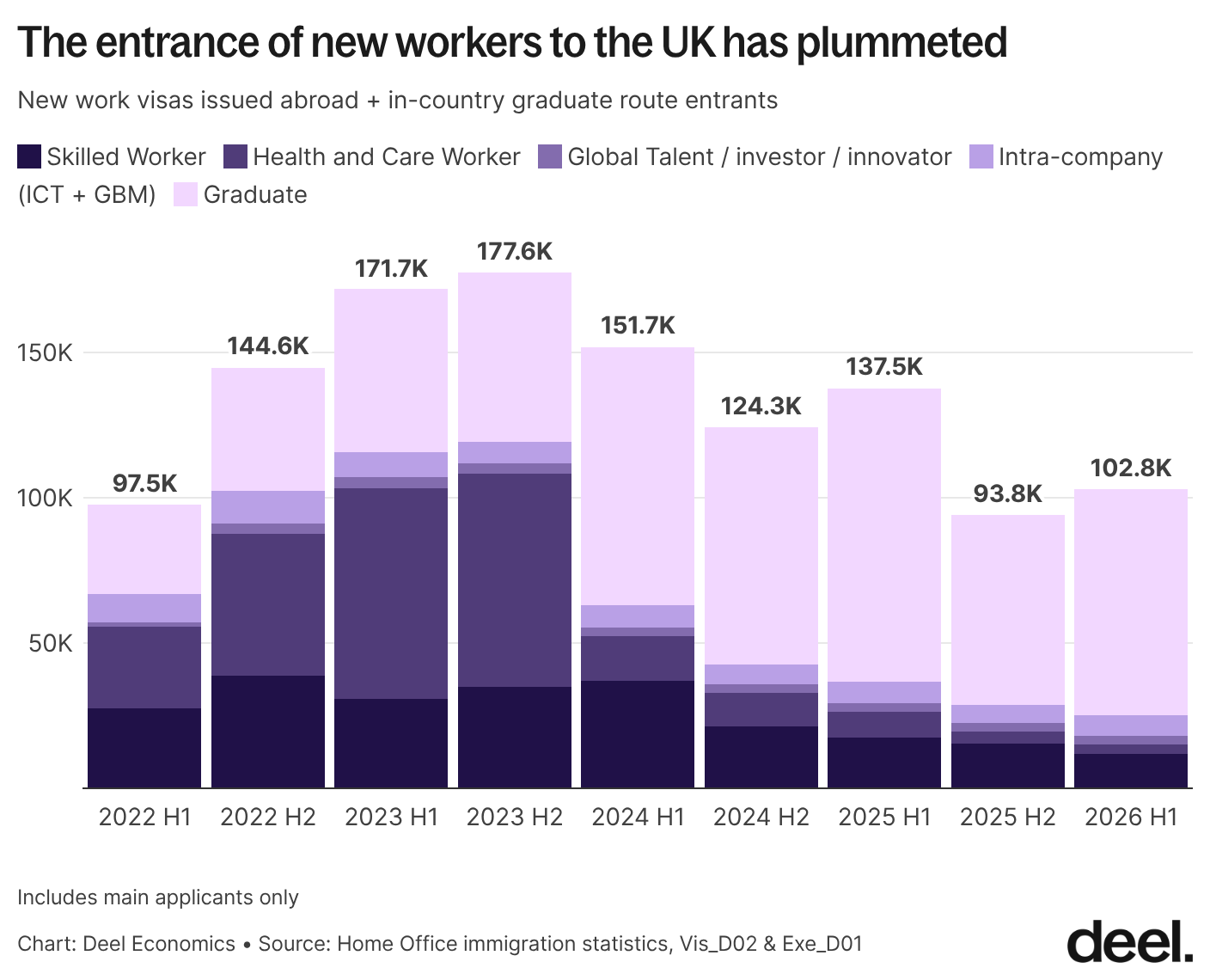
There's been a modest pickup since, to 102,800 in the first half of 2026, but that's still little more than half the 2023 peak. Skilled Worker and Health and Care Worker visas – the two categories most directly tied to filling job vacancies – have shrunk the most, which may be contributing to the employee numbers.
The self-employment picture is mixed
What about self-employment? The ONS's Companies House-based figures suggest there hasn't been a rise in self-employment. But Stripe's data tells a different story, pointing to a real rise in the number of self-employed. The gap likely comes down to measurement: Companies House only captures formally incorporated companies.
Vacancies have largely flattened
Vacancies have continued to decline, though fortunately the trend has largely flattened out. The ONS suggests smaller firms in particular may be pulling back on hiring in response to rising labour costs — both a higher minimum wage and increased employer National Insurance contributions.
Of course, it’s important to remember that surveys, just like any set of data, can carry response bias: employers frustrated by rising costs may be more inclined to voice that frustration to what they see as an arm of government. But also, labour costs really have increased over the past few years – in nominal terms, wages have gone up by a third since 2021, minimum wage has increased from £11.44 to £12.71 in two years, and employer NICs rose from 13.8% to 15% and at a lower threshold starting in April of 2025.
Real wage growth has stalled out
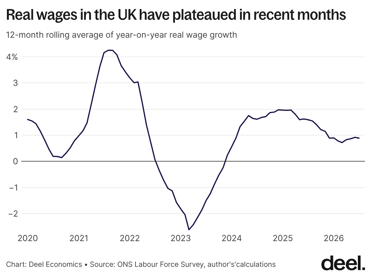
Average annual total earnings growth in May–July 2026 was 3.7% in nominal terms and 0.6% in real terms. In recent months, real wage growth has essentially plateaued: the 12-month rolling average peaked at just under 2% in early 2025 and has since drifted down to around 0.7-0.9%, where it's held for the last several months.
After the sharp swings of the pandemic years – real wages fell more than 2% at their 2023 trough before rebounding above 4% in 2021 – this current plateau looks almost sedate by comparison. But "sedate" also means workers are getting only modest real gains right now.
Data deep dive: a very European summer
Last month, I posted a graph showing the gap between how Americans, Brits, and the French take summer vacation. In the process, I noticed that other European countries also had some pretty interesting patterns.
So I took a look at the numbers for the summer of 2026, across nearly 100k requests from 30k+ employees in eight European countries. We often think of Europe as a monolith, but that's not the case. Northern Europeans (with the notable exception of Sweden) look far more like their British counterparts than the South does.
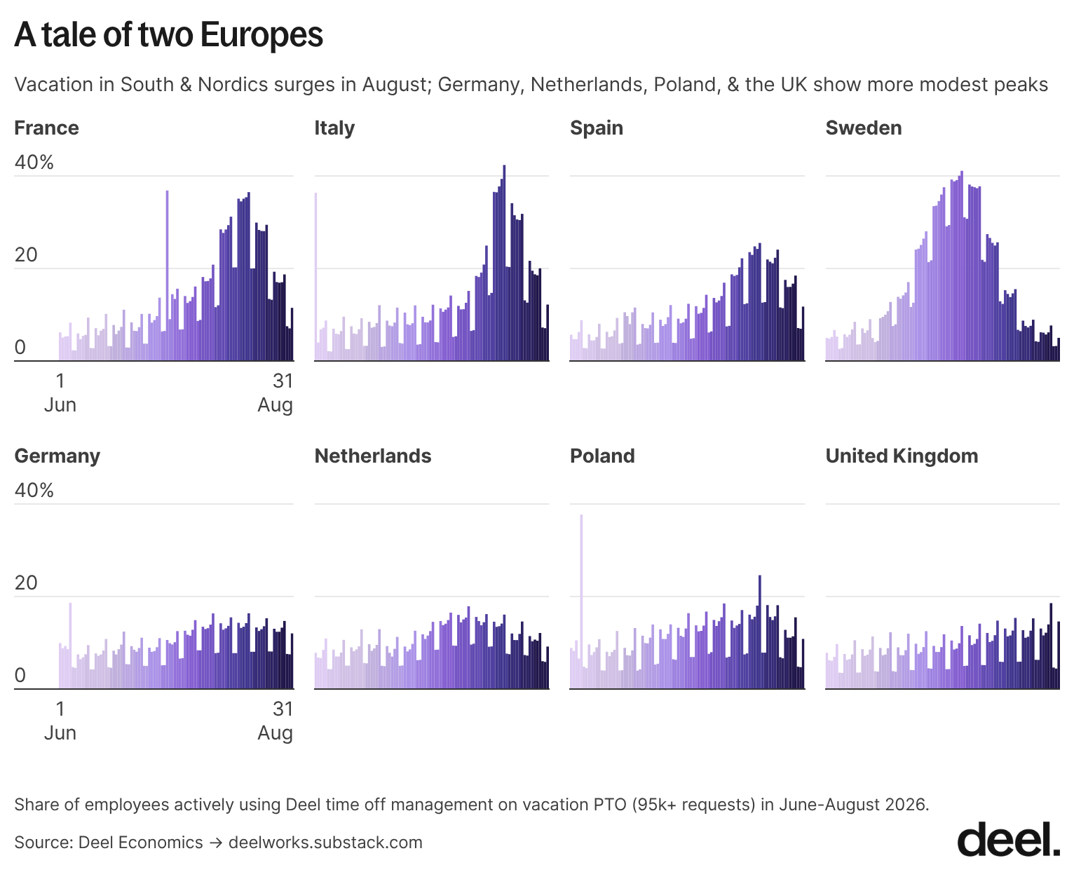
National holidays are still the biggest drivers of time off. The day before Bastille Day, July 13, was France's peak day this past summer. The 1st of June (the day before Italy's Festa della Repubblica) was Italy's. Both days were Mondays, meaning people who took those days off had a four-day weekend when combined with the Tuesday holiday itself. That’s a pattern we’re seeing over and over in our data.
That’s it for this month’s roundup – see you next time!