Article
6 min read
What’s New: Deel Reporting & Analytics Overhaul
Deel news
Global HR
Author
Deel Team
Last Update
November 28, 2025
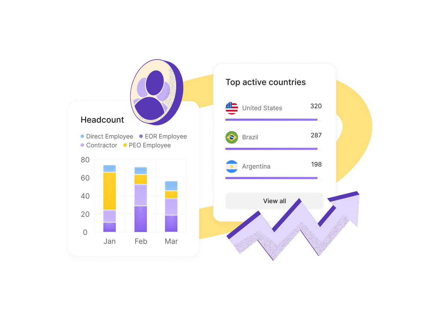
Table of Contents
Why people analytics are important to HR teams
What’s new with Deel analytics
Examples of how reporting works
Where to find Deel analytics
What’s next
We’ve completely reinvented Deel analytics so you can explore HR, payroll, and workforce data without jumping to spreadsheets. Build the report you need, turn it into a chart, and save it to a dashboard your leaders can trust, all in one place.
If you want a payroll cost breakdown by country, time-off trends by team, or headcount by worker type, you now have a more flexible and functional reporting built right into Deel.
Why people analytics are important to HR teams
Leaders ask for clearer insights, fast. For many teams, that has meant pulling data from different systems and asking for help to stitch it together.
The new Deel analytics brings reporting and dashboards on top of your Deel data. You can explore all your Deel data across multiple dimensions, build dashboards, and share with the right people. Reports update as your data updates, so dashboards stay current without manual rework.
The more of your people ops you run on Deel—HR, payroll, EOR, benefits, expenses, workforce planning—the stronger your analytics become. Connected data means better context and better decisions.
Analytics homepage on Deel
What’s new with Deel analytics
Report builder, upgraded
Answer more questions with more data. Build tables and visuals across HR, payroll, EOR, benefits, expenses, time off, headcount, and workforce planning. Then group, sort, and filter to get exactly what you need. Filter by any field. Aggregate by any field. Create custom measures. Choose currency and date formats that fit your audience.
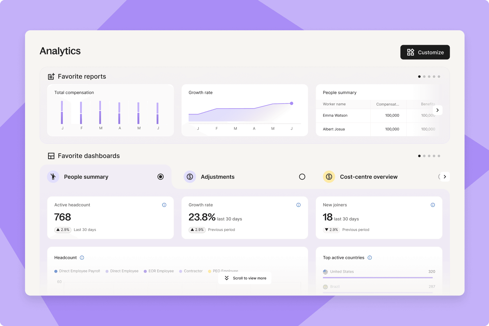
Custom dashboards
Create custom dashboards, or start from a template. You can add different reports, update who can see what, provide instructions, and share them with team members. You can share a payroll cost report with Finance, and it’s always up to date.
Visualize your data
X/Y axes sit at the top. Add, change, or remove fields with a click. Use the left sidebar for fields and filters. Switch chart types any time, choose between table, bar, line, area, donut, and KPI tiles. Apply cell visualizations and conditional formatting to highlight what matters.
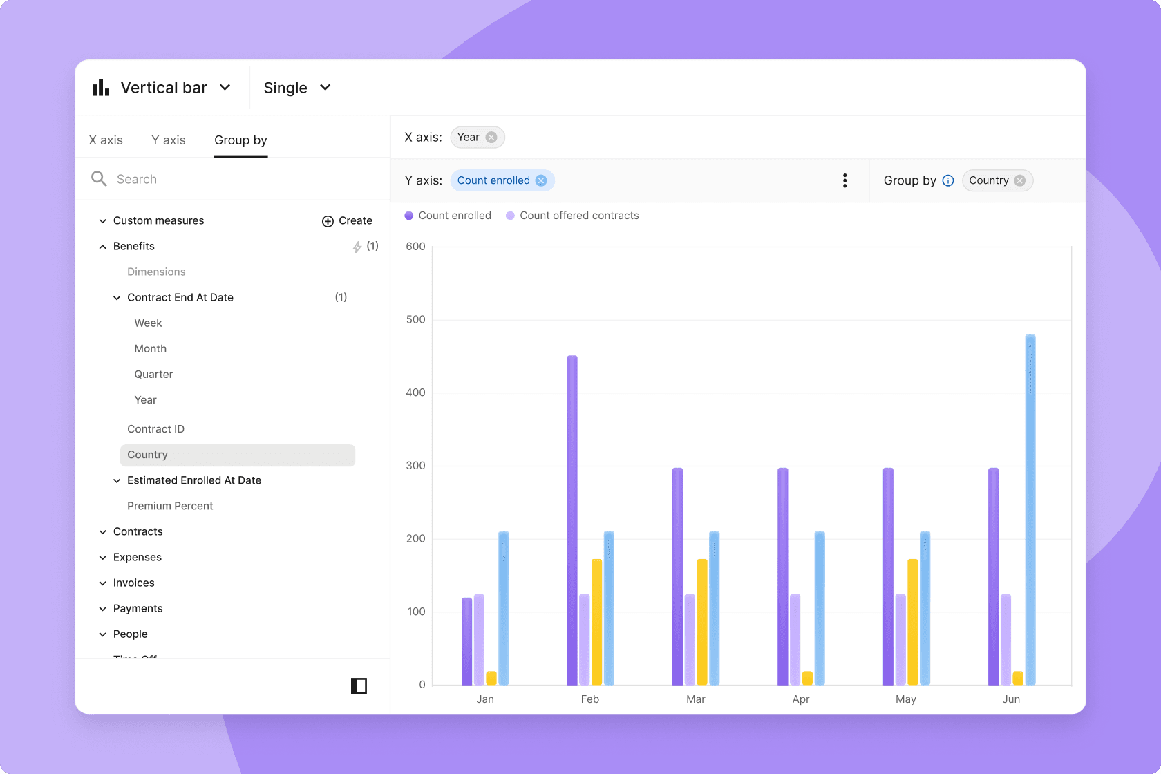
Create reports and charts in Deel
Pivot tables for deeper breakdowns
Create multi-level summaries (e.g., Worker type → Department → Country) with subtotals. Drag to reorder. Go up to three levels with up to 100 columns for rich comparisons.
Why pivot tables? They allow you to rearrange how data is grouped, so you can compare categories side by side, spot outliers, and roll up totals. Great for questions like “How does headcount mix look by region and by team?” or “Where are costs trending by entity and month?”
Smarter data + faster performance
A central data model and pre-calculated metrics reduce manual math and improve trust. Under the hood, data pipelines now load and update reports faster.
Templates to jump-start reporting
Pick from ready-made templates similar to today’s reports or build from scratch. More templates are on the way.
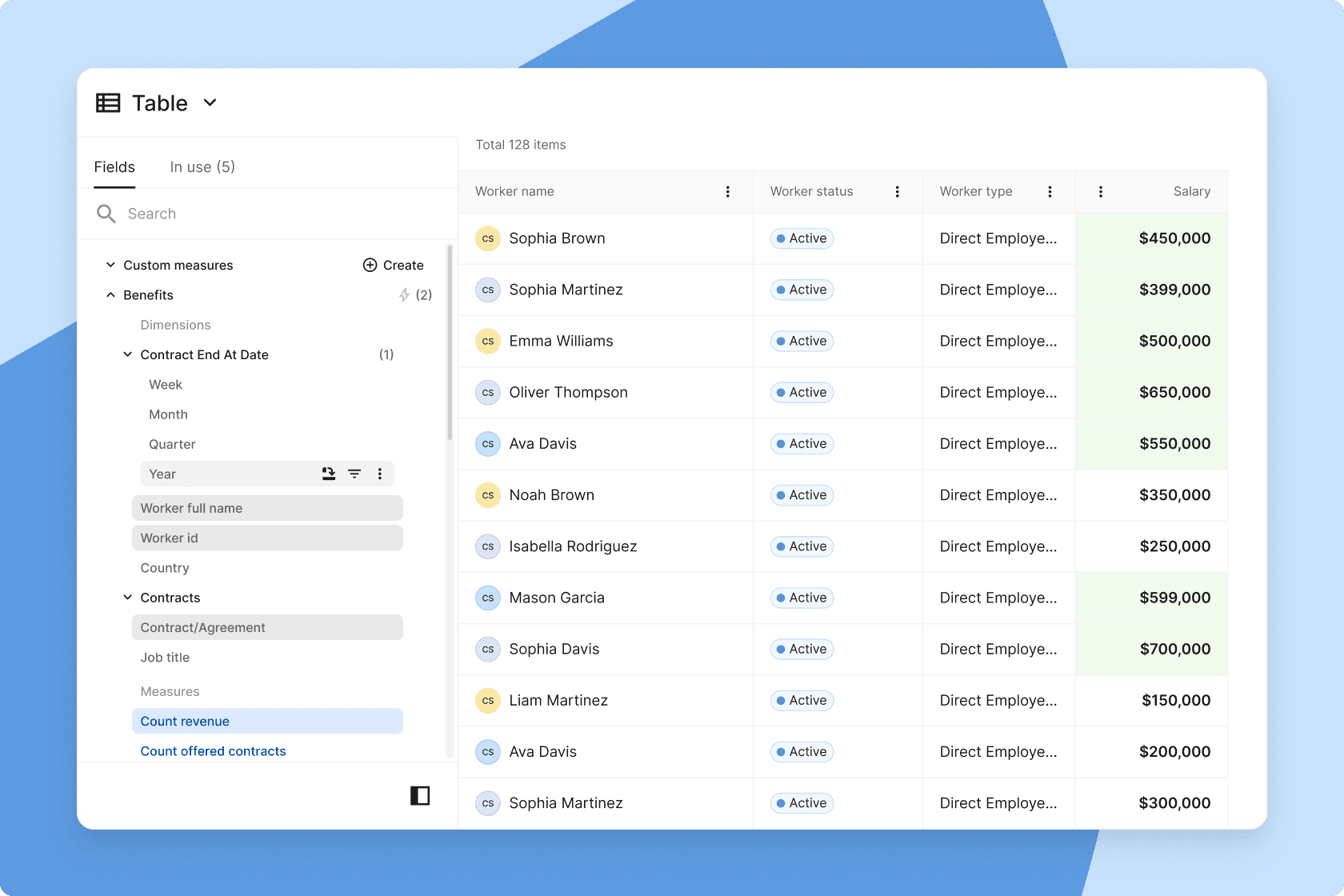
Add filters to your reports in Deel
Examples of how reporting works
Dimensions (X-axis): The “by what.” Examples: Country, Department, Manager, Worker type, Entity, Month/Quarter/Year.
Measures (Y-axis): The “how many/how much.” Examples: Headcount, Total payroll cost, Churn rate, Time-to-hire, Time-off days, Benefits cost.
Filters: Narrow your view by date range, employment type, entity, policy, status, and more. Use AND/OR logic to combine rules (e.g., Country is not empty AND Time-off status is Approved/Requested/Used). Field-level filters help you refine a single metric without touching the rest of the chart.
Group by: Break down a measure by any dimension to compare categories (e.g., cost by Country, headcount by Worker type).
Multiple measures: Add more than one measure to the same chart to compare side-by-side (e.g., Accrued vs. Taken vs. Remaining time off).
Chart switching: Validate your logic in a table first, then switch to a bar/line/pie/KPI. Change types at any time.
Where to find Deel analytics
Open Deel and go to Analytics. You’ll see Reporting (the builder) and Dashboards. If you already use saved reports, they’ll be there, now with the new builder, chart options, and dashboard tools.
Tips for lean HR teams
- Start with a template. Swap in your entities, teams, or dates; then customize.
- Keep labels simple. Short, plain names beat jargon.
- Build for your audience. One dashboard for Finance (cost, benefits, expenses), one for People Leaders (headcount, hiring, time off), and one for Execs (top KPIs).
- Connect more data. The more of your workflows you run on Deel, the more complete your analytics become.
What’s next
We’re building distributed analytics so insights meet people where they work: scheduled reports via email or Slack, a live Excel connection, so you can refresh without CSVs, and APIs for third-party tools. We’re also rolling out more templates and UX refinements to make building even smoother. Finally, we’re adding additional permissions and sharing functionality.


